Windows Into the Past
Period drama can give us a window into our past… and production designers decide whether that window will be rose-coloured or covered in grime. Steve Barr talks with John Harding about the pleasure and challenges of designing movies set in bygone times.
“The thing about period films is that people have either no memory or a coloured memory of the time. So you can make your statements without people going ‘huh?’”
John Harding is a multi-talented production designer and costume designer, with an impressive list of credits including Home by Christmas, Avatar, Predicament (for which he just won best production design for a feature film at the AFTA awards) and the recent telefeatures Rage and Tangiwai – A Love Story.
Those latter two stories would be interesting enough if they were set in modern times, but as an added level of interest (and production challenges) they both depict distinct periods in our country’s history. Rage – set in the turmoil of the 1981 Springbok Tour, and Tangiwai – a story of love and loss revolving around the tragic 1953 train disaster.
When presented with a period piece, John’s process has several phases. “First I need to know who the director is, because that tells me the style of one of the creative team. Then I need to know who the costume designer is, because that influences the style as well,” he says.
Then it’s time to hit the books. “Research is huge. My primary source is always the script, but then I start wallowing in the research. I’ve got an extensive library; I spend a fortune on books. And now with Google and Trade Me we do a lot of online research. That’s when you have to ask the producers ‘Please, please, please can we have a decent printer?’ More often than not, my walls will be awash with imagery.
“Rage spanned four years from Biko’s death. We built a chronological map around the walls of the room, and then we allocated colours and themes and arcs in the story to that chronological map. We’d ask ourselves ‘At what point is the first time we’ll see barbed wire? At what point do we want to show the bins and barricades?’ They may have been in the scene, but I don’t want the movie to jump this far this quickly.”
He continues, “We were lucky with Rage, because every amateur cameraman was taking footage. And we scored 18 hours of police footage, which no one had ever seen before. They’d hired professional cameramen to go in amongst the crowds and shoot people rather than shoot from a distance. They wanted to recognize faces, so they were inside the crowds as the fences are being pulled down and the smoke bombs were going off. That was quite neat.
“I also research where New Zealand was at, and then I usually step back five or ten years because often our purchasing ability in that era was behind the times. Tangiwai is set in 1953, but most of it was 30s architecture and 40s decorations. You know, people got married and got a lounge suite, and it stayed with them until they died. So you’ve got a 30-year window to pick and choose the shapes and styles and sizes that you want. That lets you support the character.”
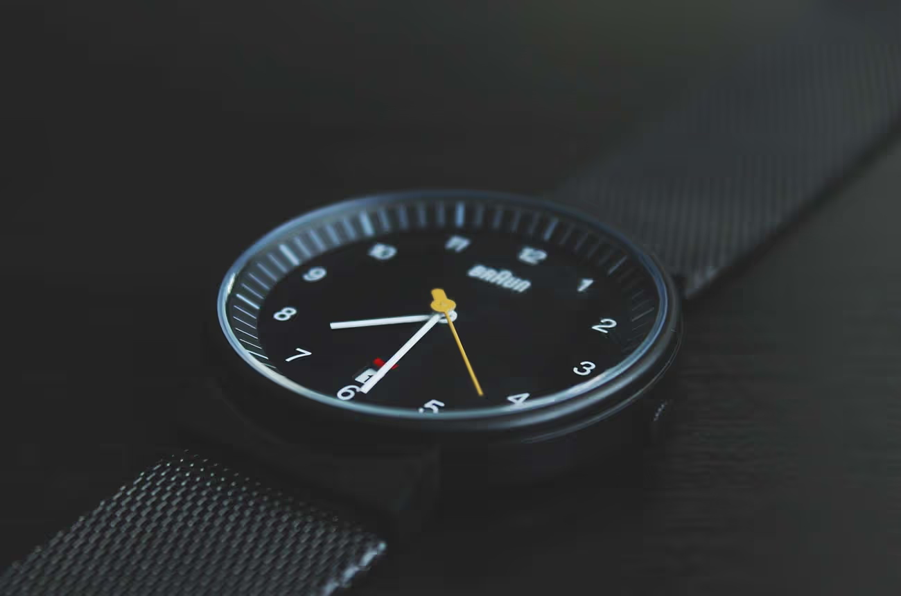
Whether he’s designing the costumes or the production, he enjoys working with actors. “You can say something like ‘I’m thinking your character is a prisoner of Mother England, maybe, still a bit British.’ Or ‘I don’t want to give you a modern watch, I’ll give you your grandfather’s watch.’”
Often it’s the little details that help the actors immerse themselves in their characters. For Tangiwai, John and his team had to recreate over a hundred handwritten letters from the time, which provided a useful element of verisimilitude for the actors involved.
“I remember having a fountain pen, and all it did was go all over your hands and all over the paper. When we had a character writing letters, we made sure we put fountain pen ink all over his fingers. The actors like that, because it’s what happened.”
For Rage, John remembers “I found a teaspoon that was used in the Prime Minister’s office in 1976. The Beehive was enamelled into the handle. So we used it for Jonathan Hendry to stir his cup – and you’d see him turning the spoon slightly to face camera for you. It was quite lovely.”
But production design isn’t just about period minutia. The design must reinforce the tone of the movie in general, and underscore the storytelling intent in each individual scene and characterization.
“I try to reinforce the emotional style of the story. Quite heavily in some of the color choices, shapes, and sizes. In Predicament, the good guys are in a shredded, tatty Victorian house, but the villains were art deco. Their colors were yellow and purple because they’re complementary colors that clash, where everyone else was rich green and burnt oranges of rural New Zealand.
“In Tangiwai, there’s a strong Catholic thread running through. I used the oppressive nature of the old religion to show the Love family – having been through the war and the Depression – had all of the color sucked out of their world. I mucked it up a little in the grade and popped the lighting up a bit.
“Any time Nerissa’s teenage energy swept into the house, it was like a burst of spring flowers. And she’d often bring lovely flowers in with her. Then at the end when she’s in the coffin – it’s dark, everything is bleak, and it was sort of like the religion had won and killed her… but a giant bunch of roses had been sent to her by her fiancé, and that color was going to be laid on the coffin. Miranda [Harcourt] chose to just use one flower, but the point was still the same.”
The subtext created by the house designs went even farther. “The Catholic house was monochromatic, like a line drawing. Dark, heavy architecture. Everything was painted cream, bone, black, and white. Everything had a bleakness, had been destroyed by the family secret. But when you go to [Bob Blair’s] house, with his insane Scottish grandparents playing the bagpipes and wearing tartan, the walls are electric green and the view out the window is real, with giant trees bursting through the windows. Everything was alive and colourful and green, because his family wasn’t oppressive. They had humour and supported him.”
In the monochromatic Love house, “[Nerissa’s] bedroom looked like it was a different house entirely, but I designed the set so you could always see glimpses into her room through almost every part of the house. You got introduced to it, that it was a little enclave. Even though she was already in her twenties, she was still surrounded by all of her childhood things.”
Designing the sets to reinforce the characterizations doesn’t stop with the main characters. “We picked a lovely house, but it had no garden, so I had to build that grotto and greenhouse. Nerissa’s father also escapes the oppressive nature of the house, so we built that greenhouse for him to escape to. That scene was originally set in the house, but I built the greenhouse so he could be surrounded by growing things. I wanted the dad to be a nurturing kind of person, and the greenhouse represented that.”
A similar thought process went into the different sets used for Rage, particularly in playing with colour. “The cold blue of the police force was carried right through. All the sets were the same blues, monochromatic black and blue. In so much of the original footage you saw the line-up of hard uniforms and hard faces, versus a sea of colour.
“The film starts off with people in home-knit jerseys and bright yellow raincoats; they were gathered to remind the world of Steve Biko’s death. And then they started drawing up placards and pushing babies in prams, and then the placards became shields and the raincoats became armour and they had to put on their helmets. They slowly armoured up over the course of the production, but we still added many brightly coloured helmets, so as often as possible we got this sea of colour, which I saw as political colour, intellectual colour, freedom of will, and a mix of ages and socioeconomic groups coming out of the woodwork to protest. But always they’re up against this wall of blue. Even the rubbish bins were blue. Barriers were blue. Everything the police had was blue.”
Harding didn’t use the blue palette in the Prime Minister’s assistant’s office, “because it was way too much fun to build that set as close to the original as possible, which is a sea of wood. I did like having him sit up there, high in his semi-circular office, looking down on the world. Completely detached. Orange and brown curtains and artwork and the lovely phone and the big telly, completely oblivious of what the common man was doing down there.”
The same could be said of the Rugby headquarters. “It was the wall of police-uniform blue, these old faces, chain smoking, so there was lots of smoke. And a wall of black and white photos of their past lined up behind them. So there was no moving forward, there was no embracing the colour.”
When asked about his favourite part of his job, his answer is immediate: “The people. I love working with a good art department. And a great director who is all fired up and wants to tell a great story. I love the storytelling. And I get a group of people who rush over to me saying ‘Here are four different types of handwriting for the letter. Which style of handwriting do you think this mother would have? I’ve talked to a handwriting expert, and he said this style here would be taught in schools from the forties through the seventies.’ And I’m going, ‘Ah, that’s great, but I don’t think they’ll ever open the envelope.’
“I tell my department that 80% of what we build will never be seen, but we can’t tell which 20% they’ll shoot so we have to do it all. We have to do 360 degrees but then they’ll end up shooting against a wall.”
Coming from someone else that statement might seem like a complaint, but Harding takes it all in stride. He finds great pleasure in the collaborative nature of the filmmaking process.
“In NZ, often the writers are the producers. They’re there every day; you can pop your head around and ask them questions. [Writer/Producer] Paula [Boock] turned out to be one of New Zealand’s top female cricketers. So cricket was very big in Tangiwai.
“On Rage, Tom Scott was writer and producer. It’s fantastic when you have the writers there. You can find out if they put something in because it’s just clever, or whether it’s important to the story.
“One of the great things about [Rage’s director] Danny [Mulheron] is that he’s got this wicked sense of humour. If I punctuate the energy that he’s going to bring to the scenes, it works really well.”
While the Director of Photography often comes in later than most of the other creative collaborators, Harding enjoys working with them as well. “Recently I’ve been doing a lot with David Paul. He’s a genius. I feed him as many images as I can. The bedroom in Rage, where the love scene is – I just wanted it to be an exquisite landscape of top lighting, very soft lighting on their bodies. I talked to Paul and Danny about it not being cheesy or silly, and they got it. It was all about the quality of the light.”
In Harding’s mind, a movie’s success all comes down to the people involved. “A lot of energy goes into building a good crew. I’d rather have a great crew and not much money, than a whole lot of money and a bad crew.”